
Selecting the perfect wood colour for your entertainment center is more than a simple aesthetic choice; it is a strategic design decision that directly influences how spacious, bright, and cohesive your living space feels. The right hue can visually expand a compact apartment, ground a sprawling open-concept layout, or tie together seemingly mismatched furniture pieces. To make the correct choice, you must balance your living room’s physical dimensions, its natural and artificial light exposure, and the dominant undertones of your existing floor and furniture.
Because the television area is naturally the focal point of most modern living rooms, the console you choose will draw immediate visual attention. A mismatch in wood tone or scale can make the entire room feel disjointed, cluttered, or unexpectedly dark. By taking a systematic approach to assessing your space, mapping your current palette, and understanding how different wood tones behave, you can select a console that feels like a natural, intentional extension of your home.
How Living Room Size and Lighting Dictate Your TV Console Wood Colour
Your living room’s physical footprint and the light it receives are the two most critical factors in determining how a specific wood colour will behave. Wood finishes possess inherent visual weight. Darker woods, such as deep walnut, espresso, or wenge, absorb light and draw the eye downward. In a compact apartment or a standard HDB flat, a large, dark console can act as a heavy visual anchor, making the surrounding space feel significantly smaller and more enclosed than it actually is.
Products mentioned in this guide

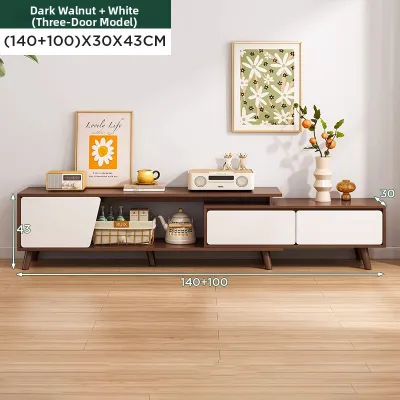
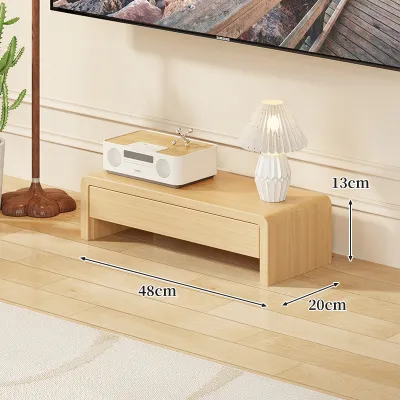
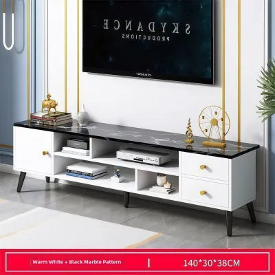
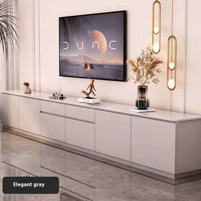
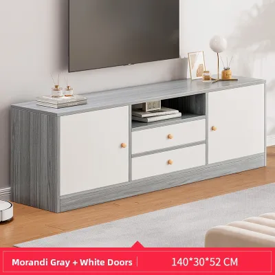
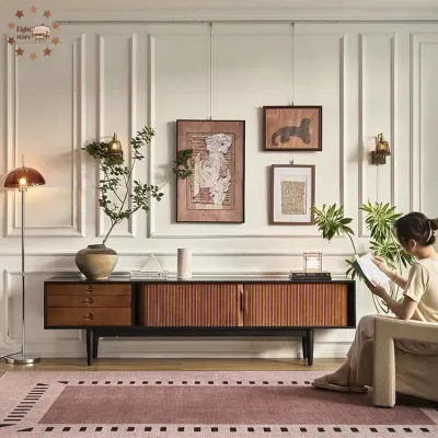
Prices are valid at publication and may change. Please refer to the product page for the latest price.
Conversely, light wood finishes, such as ash, maple, or light oak, reflect light rather than absorbing it. This reflective quality helps open up smaller living rooms, making the entire wall feel airy and expansive. If your living room is narrow or has a low ceiling, opting for a lighter wood tone keeps the visual plane clear and prevents the entertainment zone from feeling overly dominant.
Beyond room size, the temperature and direction of your lighting play a massive role in how a wood’s colour is perceived. Singapore homes often experience intense, direct tropical daylight during the afternoon, which transitions into varied artificial lighting setups at night. Natural daylight is relatively neutral, showing the true, balanced colour of the wood grain. However, the artificial lighting you use in the evening can dramatically shift these tones.
If your living room relies on warm white LED bulbs (typically 2700K to 3000K), the yellow, orange, and red undertones in woods like teak, cherry, or warm oak will be heavily amplified, sometimes making them look much brighter or more saturated than they appeared in the showroom. Under cool white lighting (4000K or higher), these same warm wood tones can appear muted, washed out, or slightly greyish. To avoid surprises, you must observe your living room’s dominant light sources at different times of the day—especially during the hours you use the space most—before committing to a specific finish.
Before finalizing any colour choice, you must also prioritize the physical and structural constraints of your space. A solid wood console is heavy and rigid; always verify its finished dimensions against your available wall space, ensuring it does not block walkways or entryways. If you live in a high-rise development, check that your building’s lift and doorways can safely accommodate the delivery of the unit. Additionally, check the manufacturer’s specified load capacity to ensure the console can safely support your television and media equipment without bowing or losing stability over time.
Map Your Existing Furniture and Flooring Palette
To ensure your new TV console harmonizes with your home rather than clashing with it, you must conduct a quick audit of your current living room palette. The goal is not to match every piece of furniture perfectly—which often results in a flat, sterile showroom look—but to create a balanced mix of tones that share a common design language.

Start by identifying the dominant undertones of your flooring, sofa, rugs, and major storage cabinets. Categorize these elements into warm, cool, or neutral undertones:
- Warm Undertones: Characterized by yellow, orange, red, or golden hues. Common in traditional parquet flooring, teak furniture, and warm beige upholstery.
- Cool Undertones: Characterized by grey, ash, blue, or taupe undertones. Often found in modern concrete-look screed floors, grey vinyl planks, and cool-toned fabrics.
- Neutral Undertones: Balanced tones that do not lean heavily toward warm or cool, such as true off-whites, greiges, and soft, natural wood finishes.
Once you have identified your dominant undertones, decide whether you want to pursue contrast or cohesion. If your living room features light oak vinyl flooring, placing an identical light oak console directly on top of it can cause the console to visually disappear into the floor, stripping the room of depth. In this scenario, introducing contrast—such as placing a medium teak or rich walnut console against the light floor—grounds the entertainment zone and creates a sophisticated focal point.
If you prefer a seamless, minimalist aesthetic where the console blends into the background, you can match the wood tone closely to your flooring or walls. However, to prevent the space from looking monotonous, introduce different textures, such as a ribbed or slatted wood front, which adds shadow and depth without introducing a new colour.
To maintain visual balance, follow the rule of limitation: limit the number of distinct wood tones in a single room to a maximum of two or three. Introducing too many different wood species—such as pairing a pine coffee table with a teak dining set, an oak floor, and a dark walnut TV console—creates visual clutter and ruins the room’s design cohesion. Choose one dominant wood tone to cover the largest surface area (usually your flooring), and use the TV console as either a matching companion or a deliberate, contrasting accent.
Choose the Right Wood Colour Based on Your Assessment
With your room size, lighting conditions, and existing furniture palette mapped out, you can now match your requirements to one of the three primary wood colour categories.
Light Wood Tones (e.g., Ash, Light Oak, Maple)
Light wood tones are highly versatile and serve as the foundation for Scandinavian, Japandi, and minimalist interior design styles. Because they reflect a high percentage of light, they are the ideal choice for compact living rooms, narrow layouts, and spaces with limited natural light exposure.
These pale wood finishes pair exceptionally well with cool greys, crisp whites, soft cream tones, and pastel accents. They keep the visual weight of the room exceptionally low, allowing you to choose a slightly larger console with more storage space without making the room feel crowded.
When shopping for light wood consoles, remember that a material name alone does not guarantee performance. Light-coloured woods can be more susceptible to showing visible water rings, dust, and minor scratches over time. Always check the manufacturer’s care instructions and verify what type of protective lacquer, varnish, or polyurethane topcoat has been applied to the surface. This is particularly important in humid climates, where unprotected wood can absorb moisture and warp.
Medium Wood Tones (e.g., Teak, Cherry, Walnut)
Medium wood tones strike an excellent balance between light and dark finishes, offering rich character and warmth without overwhelming the room. They are the hallmark of mid-century modern, transitional, and rustic design styles, making them incredibly popular for creating inviting, cozy communal spaces.
These tones complement earthy colours (such as olive green, terracotta, and mustard yellow), rich leather upholstery, and warm, layered ambient lighting. Teak, in particular, has a timeless appeal in Southeast Asian homes, bringing an organic warmth that pairs beautifully with indoor houseplants and woven natural-fibre rugs.
Because medium-toned solid wood consoles are often heavy and dense, structural stability is paramount. Ensure the unit features robust joinery and stable legs. If you are opting for a wall-mounted floating design to save floor space, verify the anchoring method and ensure your wall material (such as concrete or solid brick versus hollow drywall partitions) can safely support the combined weight of the console and your media devices.
Dark Wood Tones (e.g., Mahogany, Espresso, Wenge)
Dark wood tones exude luxury, sophistication, and dramatic contrast. They are best reserved for spacious, open-plan living rooms with high ceilings and abundant natural light, as well as homes designed around classical, industrial, or high-end modern luxury themes.
To prevent a dark console from making your living room feel gloomy or heavy, pair it with light-coloured walls, metallic accents (such as brushed brass, gold, or chrome), and glass or ceramic decorative elements. This contrast prevents the console from turning into a visual “black hole” and instead highlights the rich grain patterns of the dark wood.
Due to their density and weight, dark solid wood consoles often require professional delivery and on-site assembly. Before purchasing, check if the furniture retailer provides professional installation services. Ensure your floor surface is perfectly level during installation to maintain the console’s structural integrity and prevent doors or drawers from misaligning over time.
Test and Verify the Wood Finish Before Buying
One of the most common mistakes homeowners make is purchasing a TV console based entirely on product photos viewed on a mobile phone or computer screen. Digital screens use different colour profiles, and professional product photography is typically captured under intense, highly controlled studio lighting. The actual product can look vastly different when placed under the specific lighting of your home.
To avoid costly returns and disappointment, make it a priority to request physical wood swatches, veneer offcuts, or sample cabinet doors from the furniture retailer before placing your order. Most reputable brands and local showrooms will provide these samples upon request.
Once you have the physical sample, perform a direct floor and wall test. Place the swatch flat on your living room floor and lean it against the wall where the console will stand. This simple step allows you to see exactly how the wood grain and undertones interact with your actual flooring material and wall paint color.
Leave the sample in place for at least 24 hours. Observe how the wood’s appearance shifts throughout the day: check it under the bright, natural light of midday, the softer light of late afternoon, and the warm artificial lighting of the evening. This real-world test is the only way to guarantee that the wood tone will look exactly as you intend in your unique living environment.
Avoid Common Wood Tone Matching Mistakes
Achieving a cohesive living room design requires avoiding a few frequent pitfalls that can easily ruin the visual flow of your space. By keeping these boundaries in mind, you can ensure your new TV console integrates seamlessly into your home.
First, never ignore the power of undertones. Mixing woods with clashing undertones is the fastest way to make a room feel visually chaotic. For example, placing a highly red-toned cherry wood console directly next to a yellow-toned pine floor or a cool, ash-grey rug creates a jarring contrast that is difficult to ignore. Always aim to keep your primary wood pieces within the same undertone family (all warm, all cool, or all neutral), even if the darkness of the wood varies.
Second, watch out for the floor boundary. Because your TV console sits directly on or just above your flooring, there must be a clear visual distinction between the two. If you place an espresso-coloured console on dark walnut flooring, the console will visually merge with the floor, making the entire setup look heavy and undefined. If you must use similar wood tones due to limited choices, place a contrasting light-coloured area rug underneath the console to act as a visual boundary and break up the matching wood surfaces.
Finally, do not let aesthetic choices override practical and structural safety. A beautiful wood colour is meaningless if the console cannot safely house your media setup or fit through your front door. Always check the manufacturer’s care instructions, verify the unit’s weight capacity, and ensure proper anchoring if you have young children or pets in the home. If you encounter conflicting assembly instructions or are unsure about wall-mounting requirements, always consult a qualified professional installer before proceeding.
Community discussion
Share your experience or ask a question. Comments are reviewed before publication.